Official Crab People Cult Gathering #173
Friday, 12 May 2017
Wednesday, 3 May 2017
Kinetic Typography
0:08 Slow In/Out
This transition does a good job introducing the video by slowly leading the viewers eyes to the next image.
0:10 Follow Through
This use of follow through succeeds in creating more space for an image.
0:14 - 0:20 Arc
Both examples make space for more text on the screen.
0:25 Exaggeration
Enlarges text in order to make the next transition
appear larger scale.
The Video does a good job using the principles of animation by using techniques such as Exaggeration when the voice in the video is yelling, and does a good job always setting up each frame for transition by always keeping the text filling the screen.
Friday, 21 April 2017
Still life life writeup
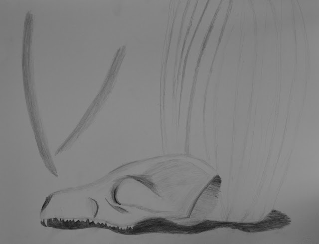
I started my piece by lightly sketching the contour lines of the skull and vase before beginning to add the second and third levels of shading to the piece, after that I used the malleable eraser to erase any remaining lines that were left over after correcting. Finally I added the last layer of shading with dark spots finishing the piece.
My composistion is an L composistion and it uses the verticality of the vase and length of the skull in order to create an L composistion. In order to make the piece feel balanced as a whole I added folds in the fabric to the top left corner to balance the density of detail put on the skull towards the bottom area of the composistion. In coclusion my still life is an L composistion that uses the folds in the fabric in order to create balance across the piece.
Wednesday, 12 April 2017
Drawing Assignment

I started my drawing with the outline of the skull before moving on to the vase, I then added shadows to the skull and vase, starting off light before going to the darker shades and drawing the shadow underneath the skull and vase. Afterwards I added the shadows of the folds in the fabric behind the skull and vase and added minor details throughout the drawing.
I used the skull and vase in order to create my L composition by using the skull as the horizontal focal point and the vase as the vertical point, focusing most of the detail on the skull in order to make the composition feel more balanced.
Tuesday, 14 February 2017
Reviewing Concepts of Photogragphy


Aperture


Shutter Speed
ISO
Friday, 10 February 2017
1. When Richard Avedon talks about a face having contradiction connection and complexity I believe he is in a way comparing a face to a canvas in the sense that it has the ability to be perceived in a number of ways having multiple ways to communicate with the reader. when Richard talks about contradiction I think he is talking about the contrast a face can have with all the imperfections and oddities and that a face can tell a story different from what the person tells you. When he talks about complexity I believe he is talking about the detail of the face when looking at it from different angles giving the face a different appearance everytime you look at it. When he talks about connection I think he means how the features of a face all seamlessly lead into one another.
2. After leaving the world of fashion photography I think the no prop bare style Avadon begins to use allows the face of the person to be the main subject of the photograph allowing the features and details of the face to stand out in a way that the viewer may not notice otherwise.
3. Photography's ability to freeze a moment that would otherwise be lost forever is what makes photography the amazing thing it is. giving the photographer power over time and perception makes photographing something unique to the art world.
4. Overall I thought the film was very insightful and helped to grasp the way that Richard Avedon saw Photography and the world, the film helped me to see a different angle of photography and I hope to use what I learned throughout the unit.


